Nokia broke a lot of hearts when it announced in 2011 that it would
use Windows Phone and not Android on future smartphones. The Finnish
giant had found itself struggling to compete in a post-iPhone world,
when consumer interest was shifting to devices with large touchscreens
and no keyboards. Since then, the company has pushed out some fantastic
hardware, but it has often seemed to be constrained by Windows Phone's
limitations and lukewarm interest from app developers.
Despite Nokia's close relationship with Microsoft, a small but vocal group of users has held out hope that it will see the errors of its ways and switch to Android. Even after Nokia announced it would sell its entire handset business to Microsoft, rumours and speculation of an Android device in the works continued to swirl.
The Nokia X: a brief history
It seems odd that the company, despite such strong ties to Microsoft, would have even been considering an Android product. Still, here we are, and we have exactly that in our hands right now. It's not the high-end phone with a slick design and record-breaking camera that everyone might have been hoping for, but it's running Android for real, and it's possibly one of the most important products Nokia has ever released.
Nokia had dominated the mobile phone market from nearly its inception till the late 2000s, but unfortunately decided to bet against slick touchscreen phones, and spent far too long chasing a failing strategy of using underpowered hardware and ancient software. After years of struggling (during which time Samsung, LG, Motorola, Sony and nearly every other competitor adopted Android), it finally decided to start from scratch and threw all its weight behind Windows Phone.
Microsoft's new and unproven smartphone OS has improved a lot since its shaky debut, but is still nowhere near competitive with Android and iOS. Furthermore, Windows Phone is totally unsuitable for low-end devices, which means Nokia has been forced to continue pushing derivatives of its older Symbian OS. Meanwhile, Android has pushed downwards quite steadily, and can be found in phones as cheap as Rs. 5,000.
Simply put, Nokia finally realised it could not afford to allow Android to displace it in the value segment, and that no one was interested in supporting yet another new OS. So it finally turned to Android - or as we now know, its underlying Linux foundation.
While Android itself is open source, Google is responsible for a layer of software and services including the Google Play app store, Google Maps, various search capabilities including Google Now, and frameworks for apps to run on. All Android licensees must include these apps, and follow Google's guidelines for how devices should look and behave.
Nokia and Microsoft are clearly not interested in promoting Google's search, maps and other hooks when they have their own. That means ditching Google's services, which is something traditional hardware companies such as Samsung and LG cannot do. Thus, you'll see Bing search, Office, OneDrive and Nokia Here maps, with no sign of Google anywhere.
So just like Amazon did with the Kindle Fire OS, Nokia has forked the Android codebase and put its own spin on things. The resulting Nokia X platform has a lot in common with Android, but the Nokia X is not technically an Android phone - it cannot use Google's trademarks.
Still, the company is reaching out to app developers with the promise that things should work exactly the same as they do on Android. 75 percent of existing Android apps are said to work, but that doesn't mean every function will work flawlessly. Specifically, apps which tie into Google's push notifications, in-app payments and maps APIs will have trouble.
The current version of the Nokia X platform is based on Android 4.1.2, which is pretty old now. We'll just have to see if that becomes a problem.
The Nokia X is one of three confirmed devices on the Nokia X platform. There is definitely a place for these phones in the market right now, but we don't know whether Microsoft will continue development, focus on improving Asha, or broaden Windows Phone's reach once its acquisition of Nokia is complete.
Nokia X: the hardware
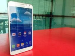
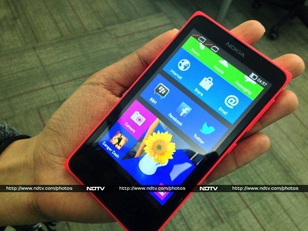
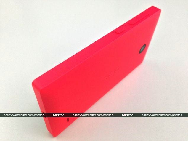
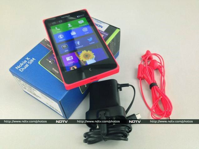
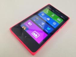
No matter how alien its innards are, there's nothing surprising about the Nokia X device itself. It looks very similar to the recent Asha 5xx series. It's a boxy rectangle roughly the size of an iPhone 4, with a slightly bulging back and completely flat sides. Our review unit was bright red (almost too bright!), but the X is also available in white, black, blue, green and yellow.
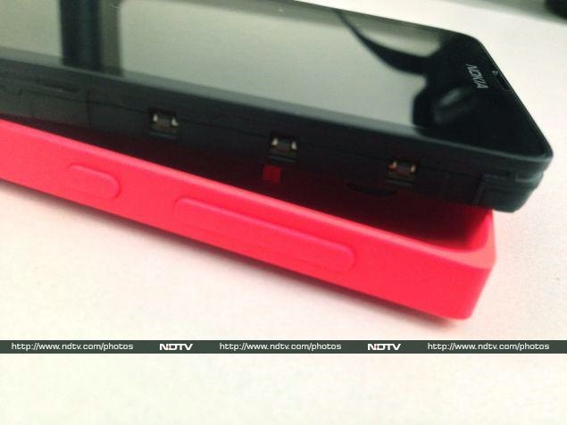
The coloured shell fits around the back and sides of the Nokia X, forming a coloured border around the black screen and bezel. Tt takes a bit of pushing and bending to make the shell pop off, since the phone itself fits very snugly. We fully expect Nokia to play up customisability by selling various coloured shells as aftermarket accessories.
The shell has a matte plastic texture which is easy to grip, but the corners are a bit sharp and dug into our palms. The back lies flat and picks up scuffs and dirt surprisingly quickly. We wouldn't recommend letting this phone get bumped around in a bag without a protective cover, such as the transparent shells Nokia has given the Asha 502.
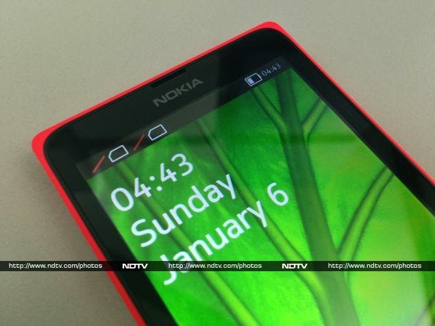
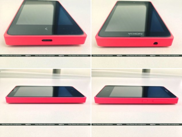
The front panel has only a single capacitive button beneath the 4-inch screen, which doubles as Back and Home. It's the same arrow icon used on Nokia's newer Asha phones, but isn't raised or otherwise demarcated. It also isn't backlit, which makes usage in the dark a bit difficult.
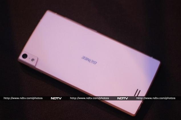
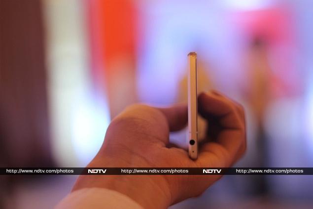
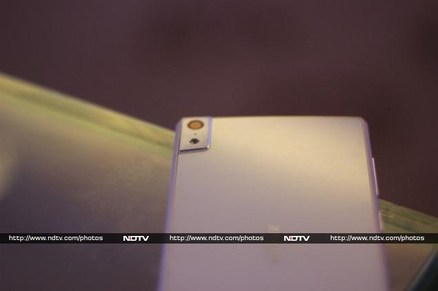
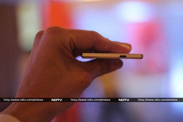
The left side is totally blank, and you'll find the volume rocker and standby button on the upper right. There's a headset jack on the top and Micro-USB port on the bottom. On the rear, you'll see the camera lens (without a flash), an embossed Nokia logo, and a small slit for the loudspeaker.
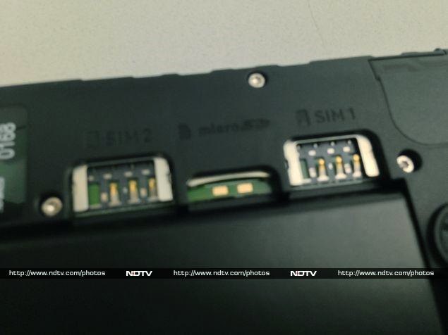
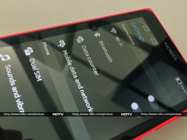
Underneath the shell, you'll see a slim 1,500mAh battery and two Micro-SIM card slots with a microSD card slot between them. The layout is neat and unfussy, though the battery does look a bit puny. Nokia might have been able to increase its size or make the phone slimmer by not using a removable shell, but the company seems to have gone for a distinctive look instead.
For a phone in this price range, the build quality is amazing. Nokia has not cut corners anywhere with the materials or construction. The Nokia X feels like a much more expensive phone than it is.
Specifications
Nokia definitely isn't going high-end with the X, and we know that it won't pose any threat to the Lumia 525, Nokia's cheapest current Windows Phone offering. So where does it stand? For starters, the processor is a rather poky 1GHz Qualcomm Snapdragon S4; that too the Cortex A5-based MSM8225 which was low-rung even two years ago. The GPU is an equally disappointing Adreno 203, and there's only 512MB of RAM.
Immediately, we can see that Nokia's primary consideration here is price. This is not a phone with any gaming or multimedia aspirations.
Continuing down the spec sheet, we can see that there's only 4GB of built-in storage, which is split between app and file storage. You'll definitely need a microSD card for music, videos and photos, but even this is limited to 32GB.
The IPS screen is a bright spot on the spec sheet, with its 800x480 resolution, which would have been considered top-of-the-line not too long ago. 3G data is supported, and there's also Wi-Fi b/g/n and Bluetooth 3.0 for wireless connectivity. GPS is a nice bonus, and there's also FM radio reception.
Three megapixels is probably the absolute minimum resolution for a smartphone camera today, and that's what we have on the rear. You'll be disappointed if you were planning to video chat, since there's no camera in front.
Clearly, hardware specifications are not going to help this phone sell. It's really all about the new Nokia X operating system.
User Interface
The hardware might be derivative, but the software is all new. We've been dying to get our hands on Nokia's flavour of Android, and we can finally get into more detail than we managed in our quick preview during the Nokia X launch event.
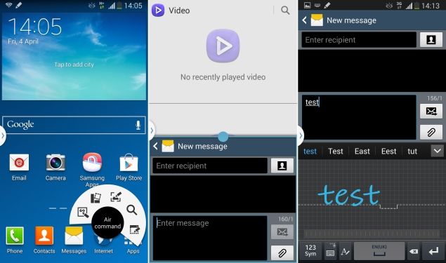
As we've already noted, Nokia has certainly put its own stamp on the Android software stack. However, it isn't trying to completely obfuscate what lies beneath. While the lock screen and home screen are totally customised, you'll see evidence of Android nearly everywhere else.
The lock screen shows the time and date as well as recent notifications. The status bar, which shows battery, Wi-Fi, signal strength and other indicators, is also visible. If you have music playing, you'll see the track name and controls instead of the day and date. Swiping on a notification will take you directly to its app, as it should.
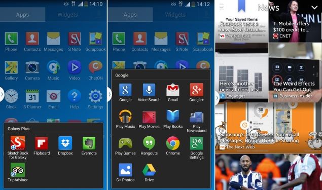
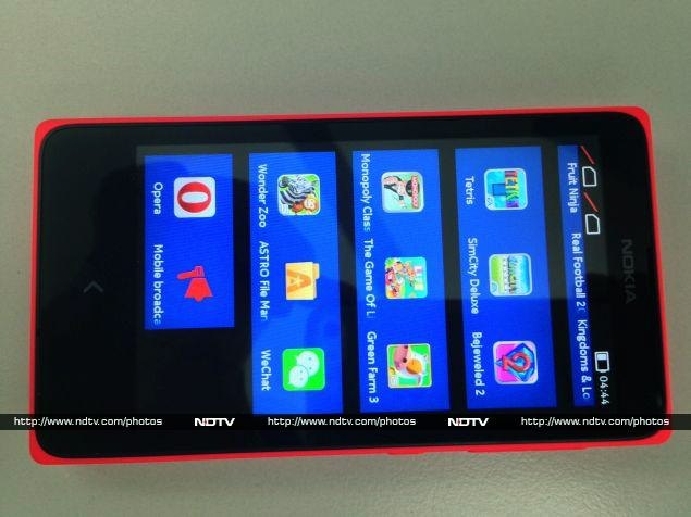
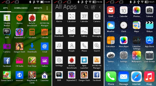
The interface seems optimised for weak hardware, and thankfully animations are short and sweet. Swiping to either side of the lock screen brings you to the home screen, which has a passing similarity to the Windows Phone home screen. Nokia has given the X platform its own visual identity while keeping things consistent across products. Rather than individual tiles, we see clusters of large square icons with no spacing between them. The icons are similar to those used in Windows 8 and Windows Phone 8.
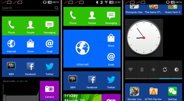
You can tap and hold to rearrange these icons and break the clusters apart, but we like what Nokia has done by colour-coding important apps. Each one can be enlarged to four times its default size, which seems a bit pointless, since these are not Windows-style live tiles that animate, except the Gallery app which does cycle through thumbnails of saved images.
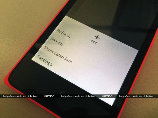
The home screen is one long list, rather than scrollable pages. For some reason, Nokia decided to allow Android-style widgets, but since the home screen and app launcher aren't separate things, these must be mixed in with the app icons. So, for instance, you can have a large clock, or a bar of toggle controls for brightness and Wi-Fi, at any random point between app icons. There's also no dock, so important icons such as Phone and Messaging aren't always visible.
Swiping either left or right from the home screen will bring up Fastlane, Nokia's hybrid notifications panel and recent events tracker which has been imported from the Asha OS. Here you can see a breadcrumb trail of sorts, with all the apps you've used, notifications, Web history, music controls, and one single shortcut for an app of your choice. Fastlane has the same hierarchical priority as the home screen, so if you jumped into an app from this view, you'll come back here instead of the home screen when long-pressing the Home button.
This is a good time to mention that the Nokia X does not support app multitasking. Apart from music playing in the background while you use other apps, everything shuts down when you long-press the Home button. Even though it shows your recently used apps, Fastlane is not an app switcher.
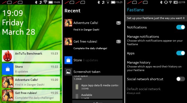
It's also how the Nokia X gets away with a single navigation button. Tapping once takes you back to whichever screen was open before, so you retrace your steps exactly as they happened, even if that means jumping from app to app. There are no on-screen buttons for going back, not even in the Web browser (which conversely means that going forward is not possible at all). You will see buttons for going up in menu hierarchies, which is a hallmark of Android design. It can become a bit confusing, but just remember that a long-tap on the Home button will always take you home - or to Fastlane, if that's where you were last.
Nokia's keyboard is fairly ordinary, but cramped by today's standards. Each key has at least one alternate symbol, so you can hold it down and slide left or right to select them, if switching to a symbol panel is difficult. There's also an Edit panel, with buttons for selecting, copying and pasting, and moving the cursor.
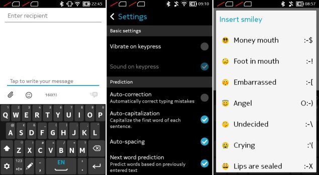
Fans of Swype style typing will be happy to find an implementation of it is included, and there are plenty of gesture shortcuts, including one to change a selection's capitalisation, changing input languages, and switching between keyboard panels. You can even switch to a handwriting recognition panel, which works one character at a time. There's no dictation feature, but we didn't miss it.
Apps
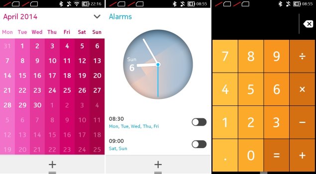
Nokia has most of the basics covered, such as a calculator, calendar, alarm clock, email client, browser and music player. They're handy, but not all are as capable as we expected. The clock app, for instance, can only do alarms. There's no stopwatch, timer or world clock.
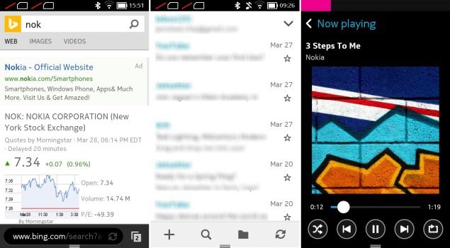
The browser, which is just called Nokia Browser 1.0, is as basic as it could possibly be. Bing is of course the default engine, though switching to Google or Yahoo is as easy as tapping an icon above the keyboard. The email app is more capable, with support for multiple accounts, one-step setup for popular webmail services, and a decent amount of control over settings, though it could do with some UI design improvements.
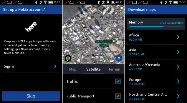
Nokia's Here Maps app includes satellite and terrain visuals, plus traffic and public transport route information in many cities. The satellite imagery we saw for Mumbai was many years out of date, but at least roads and landmarks were accurately labelled. We were happy with the capabilities on offer, which is a good thing considering Google Maps is not even an option (except via the browser).
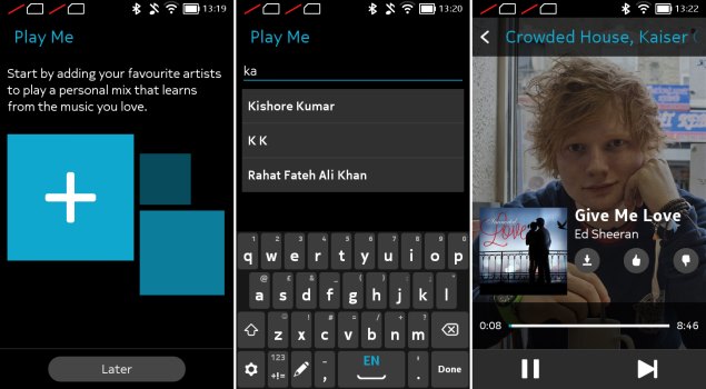
Nokia's other notable app is Mix Radio, a fantastically underrated ad-free streaming service that you can customise based on your tastes. It works by asking you to pick a pre-made mix or create on by entering three artistes. If you create your own, you'll hear tracks by those three as well as other similar artistes which the app thinks you'll like. You can skip up to six tracks in each mix per hour, and upvote or downvote tracks to help it learn what you like. In our brief testing, we couldn't find an artiste too obscure for Mix Radio, across genres including classical, folk, and even Brit punk. The search function auto-suggests Indian artistes first, and a wide range of languages and regions are represented.
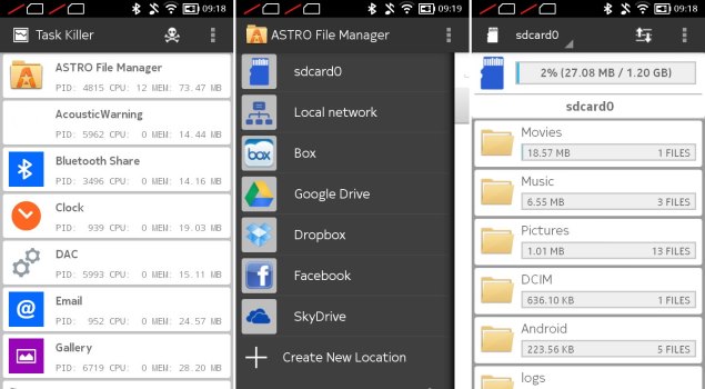
Nokia also preloads Facebook, Twitter, BBM, WeChat, Opera Mini, Astro File Manager, and a number of games. Astro File Manager is pretty useful, but it displays ads unless you pay to unlock a "Pro" version. It can show SD card usage information and includes a task manager and app manager. It also lets you browse shared devices on a home or office network, and can connect to your Dropbox, Google Drive, OneDrive, Box and Facebook accounts so you can swap files and photos between them.
Nokia Store
Of course the most interesting thing for us was Nokia's Store. The Nokia X is capable of running Android apps, as we've been told many times, but there's no Google Play storefront. Nokia's Store is crucial in helping users find and install apps, which is what gives the platform its appeal.
We found a decent number of options, including local favourites Zomato, Cleartrip, Hike, Flipkart, Cricbuzz, and others. It isn't immediately clear if these are Android apps or if they've been optimised for Nokia X, but as long as they work, that fact shouldn't be of any concern to end users. When we tried the Zomato app, for instance, it failed to detect which city we were in; not surprising, considering Google's location services aren't available. However, it did accurately show us restaurants near our actual position.
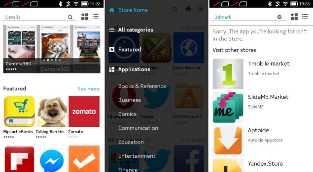
Nokia is doing a decent job of curation, and most of the apps featured on the front page are genuinely useful. We searched for a few other popular favourites: Whatsapp, Instagram and Snapchat weren't available, but VLC player, Angry Birds and Cut the Rope were. Nokia's way of dealing with this is to make other app stores easily available. 1Mobile Market, Apotide, Mobango and SlideMe Market are prominently featured. Nokia had specifically mentioned the Amazon App Store during its launch event, but there's no sign of it here.
You'll have to enable third-party app stores via a security setting, after which you can even sideload APKs on your own. This isn't exactly safe, so you should be careful about where you download Android installation files from.
Getting the most out of Android
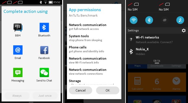
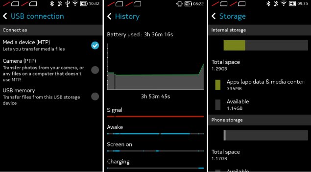
So how much of Android has Nokia really left intact? For starters, you'll find that most dialog boxes and settings screens look very familiar. Android's battery manager, storage manager, USB mode selector, confirmation dialogs, app permissions prompts, and even home screen widgets are all present and accounted for.
We had to poke around a bit and see whether Nokia had locked things down or whether we could really mess around. Amazingly, Apex Launcher installed perfectly and we were looking at a familiar Android interface within seconds, complete with multiple home screens and a separate app menu. We played around with it for a while, and other than Nokia's default app icons standing out, it seemed to work flawlessly.
We then tried a number of others including iOS7Launcher, Atom Launcher and Nova Launcher. Again, we had no trouble whatsoever. Of course, we lost access to Nokia's launcher and Fastlane, but switching back to the default was as easy as long-tapping the Home button and choosing it from the standard Android 'Complete Action Using...' dialog or tapping its icon.
We also installed a bunch of Android apps from the 1Mobile store, including the recently released Microsoft Office, and a variety of games. Performance was limited by the Nokia X's weak internals, but it wasn't terribly bad.
The Nokia X thus works well for casual users who would never even think of deep UI customisation, while giving Android fans and tinkerers a lot of power. Nokia's bet seems to have paid off: the platform is already far more capable any new OS could have been if started from scratch. Obviously, you have to have realistic expectations about which apps you want to run, but we're now tantalised by the prospect of the more capable Nokia X+ and XL, which will launch soon.
Performance
Obviously, we're dealing with a low-end phone here. Despite its ambitions, the combination of a weak S4 Play SoC and 512MB of RAM are just too little to give this phone any real oomph. Animations stutter, and even scrolling isn't quite as smooth as we'd have liked. There are long pauses while apps load, and after installing several apps over the course of a few days, we found "Please wait" messages even when switching back to the home screen.
The complete lack of multitasking also means you're going to have to wait a while for apps to load from scratch each time you tap their icons. The lack of an app switcher and long, unpaginated home screen also mean you have to dig and scroll each time you want to find an app.
Heavy websites make the browser quite sluggish, and we wouldn't recommend having more than three or four apps open at a time. On the other hand, basic games ran quite well. The ones Nokia has preloaded are quite easy on the system, and apart from long load times, didn't feel like they were overloading the device.
We ran a subset of our usual benchmarks, mostly due to the low-end specifications of the Nokia X. SunSpider and Mozilla Kraken, our browser-based tests, took 2733.8ms and 29863.9ms respectively to run, which is up to four times as long as a top-end Android phone and twice as long as models that sell in the mid-range today. Quadrant and AnTuTu gave us scores of 2,686 and 7,577 respectively, which were consistent with our low expectations, and are just about okay for a phone priced at this level. Neither 3DMark nor GFXbench, our primary graphics tests, was able to run on the Nokia X.
The Nokia X is extremely loud, and even on its lowest volume setting, system sounds such as typing ticks and the camera shutter sound are a bit too loud. Amazingly, a few of our 720p videos played. Our heavier 720p H.264 file dropped frames like crazy and was mostly unwatchable, but apart from minor stuttering in action sequences, a lower quality H.264 was reproduced quite well. The Nokia X had no problem with low-resolution video playback.
Three megapixels might seem lowly, but then again Nokia is known for great camera quality. Photo quality is actually very good, and even though they aren't too large, noise and compression are well under control. The phone struggled a bit with exposure and white balance detection, but focusing was usually quick and accurate. Details are fairly sharp even in low-light indoor shots. We definitely would have liked a flash, but that's reserved for more expensive models.
(Click to see full size)
Video is recorded at a puny 352x288 resolution, which to us, makes it rather pointless. Quality wasn't that great, so we'd only use the Nokia X for video if there was nothing else available.
Call quality was fair enough, with nothing really remarkable to mention. Battery life was just about acceptable, at just a shade over six hours in our video loop test. We wouldn't expect more than a day of reasonable usage out of this phone, thanks to the relatively small battery.

(Click to see full size)
Verdict
Nokia is obviously capable of building a fantastic ecosystem around Android, but their hands are tied. The company will soon be owned by Microsoft, but has for many years been making decisions based on the partnership between the two. For this reason, we're not sure the Nokia X platform has much longevity in it. We can only wistfully imagine the high-end flagship devices that might have been, had Nokia not signed its future away to Microsoft.
Nokia has publicly declared that Nokia X is meant to attract customers who will then be tempted to upgrade to Windows Phone, but we wonder how they've accounted for the fact that many buyers will be happy to modify their Nokia X devices and then progress to bigger and better Android phones, rather than Windows Phone which would feel restrictive in comparison.
We also don't know how (or whether) Microsoft plans to continue the Asha line and the basic Nokia phones priced well below Windows Phone's entry level, and it's very likely that the company we now know as Nokia will become a WP-smartphone-only division of Microsoft.
From a long term perspective, we have our doubts about the Nokia X. Still, Android is a whole lot better than some proprietary OS that no one would ever bother developing apps for. The X and its siblings offer non-demanding owners a decent amount of value for their money.
The Nokia X is a very clever phone, and it blows away the Android competition in its price band. If you aren't worried about life expectancy and platform updates a few years down the line, this is definitely a worthwhile phone to buy. The only real thing that makes us hesitate is the fact that the X+ and XL are going to work a fair bit better when they launch in a few weeks' time, and we'd rather wait that long to find out the price difference between these models than go out and buy the X right now.
Nokia X in pictures and OVERALL SCORE
Despite Nokia's close relationship with Microsoft, a small but vocal group of users has held out hope that it will see the errors of its ways and switch to Android. Even after Nokia announced it would sell its entire handset business to Microsoft, rumours and speculation of an Android device in the works continued to swirl.
The Nokia X: a brief history
It seems odd that the company, despite such strong ties to Microsoft, would have even been considering an Android product. Still, here we are, and we have exactly that in our hands right now. It's not the high-end phone with a slick design and record-breaking camera that everyone might have been hoping for, but it's running Android for real, and it's possibly one of the most important products Nokia has ever released.
Nokia had dominated the mobile phone market from nearly its inception till the late 2000s, but unfortunately decided to bet against slick touchscreen phones, and spent far too long chasing a failing strategy of using underpowered hardware and ancient software. After years of struggling (during which time Samsung, LG, Motorola, Sony and nearly every other competitor adopted Android), it finally decided to start from scratch and threw all its weight behind Windows Phone.
Microsoft's new and unproven smartphone OS has improved a lot since its shaky debut, but is still nowhere near competitive with Android and iOS. Furthermore, Windows Phone is totally unsuitable for low-end devices, which means Nokia has been forced to continue pushing derivatives of its older Symbian OS. Meanwhile, Android has pushed downwards quite steadily, and can be found in phones as cheap as Rs. 5,000.
Simply put, Nokia finally realised it could not afford to allow Android to displace it in the value segment, and that no one was interested in supporting yet another new OS. So it finally turned to Android - or as we now know, its underlying Linux foundation.
While Android itself is open source, Google is responsible for a layer of software and services including the Google Play app store, Google Maps, various search capabilities including Google Now, and frameworks for apps to run on. All Android licensees must include these apps, and follow Google's guidelines for how devices should look and behave.
Nokia and Microsoft are clearly not interested in promoting Google's search, maps and other hooks when they have their own. That means ditching Google's services, which is something traditional hardware companies such as Samsung and LG cannot do. Thus, you'll see Bing search, Office, OneDrive and Nokia Here maps, with no sign of Google anywhere.
So just like Amazon did with the Kindle Fire OS, Nokia has forked the Android codebase and put its own spin on things. The resulting Nokia X platform has a lot in common with Android, but the Nokia X is not technically an Android phone - it cannot use Google's trademarks.
Still, the company is reaching out to app developers with the promise that things should work exactly the same as they do on Android. 75 percent of existing Android apps are said to work, but that doesn't mean every function will work flawlessly. Specifically, apps which tie into Google's push notifications, in-app payments and maps APIs will have trouble.
The current version of the Nokia X platform is based on Android 4.1.2, which is pretty old now. We'll just have to see if that becomes a problem.
The Nokia X is one of three confirmed devices on the Nokia X platform. There is definitely a place for these phones in the market right now, but we don't know whether Microsoft will continue development, focus on improving Asha, or broaden Windows Phone's reach once its acquisition of Nokia is complete.
Nokia X: the hardware
No matter how alien its innards are, there's nothing surprising about the Nokia X device itself. It looks very similar to the recent Asha 5xx series. It's a boxy rectangle roughly the size of an iPhone 4, with a slightly bulging back and completely flat sides. Our review unit was bright red (almost too bright!), but the X is also available in white, black, blue, green and yellow.
The coloured shell fits around the back and sides of the Nokia X, forming a coloured border around the black screen and bezel. Tt takes a bit of pushing and bending to make the shell pop off, since the phone itself fits very snugly. We fully expect Nokia to play up customisability by selling various coloured shells as aftermarket accessories.
The shell has a matte plastic texture which is easy to grip, but the corners are a bit sharp and dug into our palms. The back lies flat and picks up scuffs and dirt surprisingly quickly. We wouldn't recommend letting this phone get bumped around in a bag without a protective cover, such as the transparent shells Nokia has given the Asha 502.
The front panel has only a single capacitive button beneath the 4-inch screen, which doubles as Back and Home. It's the same arrow icon used on Nokia's newer Asha phones, but isn't raised or otherwise demarcated. It also isn't backlit, which makes usage in the dark a bit difficult.
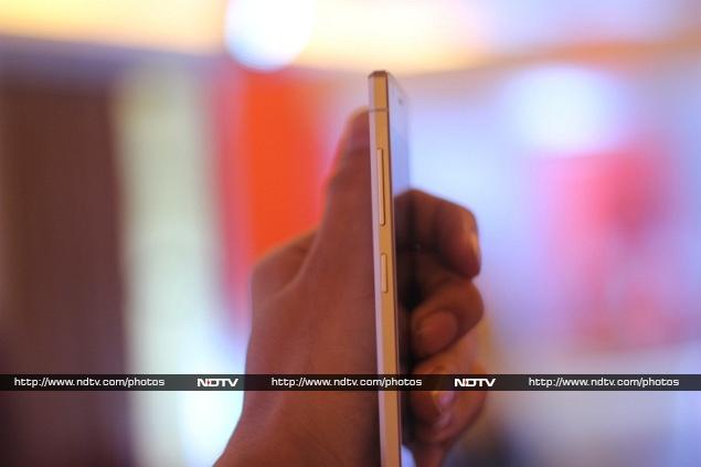
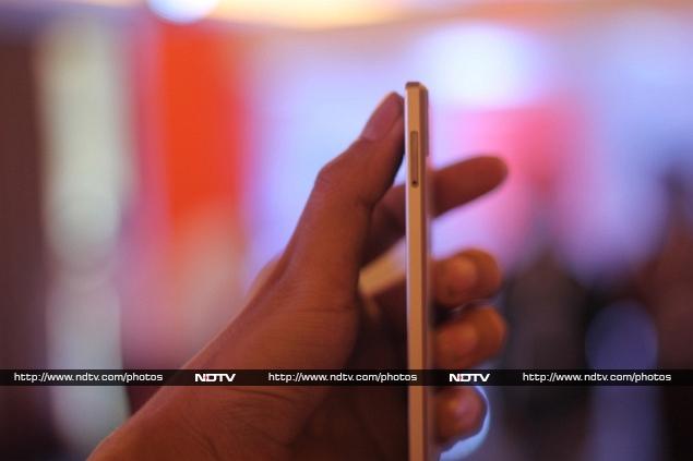
The left side is totally blank, and you'll find the volume rocker and standby button on the upper right. There's a headset jack on the top and Micro-USB port on the bottom. On the rear, you'll see the camera lens (without a flash), an embossed Nokia logo, and a small slit for the loudspeaker.
Underneath the shell, you'll see a slim 1,500mAh battery and two Micro-SIM card slots with a microSD card slot between them. The layout is neat and unfussy, though the battery does look a bit puny. Nokia might have been able to increase its size or make the phone slimmer by not using a removable shell, but the company seems to have gone for a distinctive look instead.
For a phone in this price range, the build quality is amazing. Nokia has not cut corners anywhere with the materials or construction. The Nokia X feels like a much more expensive phone than it is.
Specifications
Nokia definitely isn't going high-end with the X, and we know that it won't pose any threat to the Lumia 525, Nokia's cheapest current Windows Phone offering. So where does it stand? For starters, the processor is a rather poky 1GHz Qualcomm Snapdragon S4; that too the Cortex A5-based MSM8225 which was low-rung even two years ago. The GPU is an equally disappointing Adreno 203, and there's only 512MB of RAM.
Immediately, we can see that Nokia's primary consideration here is price. This is not a phone with any gaming or multimedia aspirations.
Continuing down the spec sheet, we can see that there's only 4GB of built-in storage, which is split between app and file storage. You'll definitely need a microSD card for music, videos and photos, but even this is limited to 32GB.
The IPS screen is a bright spot on the spec sheet, with its 800x480 resolution, which would have been considered top-of-the-line not too long ago. 3G data is supported, and there's also Wi-Fi b/g/n and Bluetooth 3.0 for wireless connectivity. GPS is a nice bonus, and there's also FM radio reception.
Three megapixels is probably the absolute minimum resolution for a smartphone camera today, and that's what we have on the rear. You'll be disappointed if you were planning to video chat, since there's no camera in front.
Clearly, hardware specifications are not going to help this phone sell. It's really all about the new Nokia X operating system.
User Interface
The hardware might be derivative, but the software is all new. We've been dying to get our hands on Nokia's flavour of Android, and we can finally get into more detail than we managed in our quick preview during the Nokia X launch event.
As we've already noted, Nokia has certainly put its own stamp on the Android software stack. However, it isn't trying to completely obfuscate what lies beneath. While the lock screen and home screen are totally customised, you'll see evidence of Android nearly everywhere else.
The lock screen shows the time and date as well as recent notifications. The status bar, which shows battery, Wi-Fi, signal strength and other indicators, is also visible. If you have music playing, you'll see the track name and controls instead of the day and date. Swiping on a notification will take you directly to its app, as it should.
The interface seems optimised for weak hardware, and thankfully animations are short and sweet. Swiping to either side of the lock screen brings you to the home screen, which has a passing similarity to the Windows Phone home screen. Nokia has given the X platform its own visual identity while keeping things consistent across products. Rather than individual tiles, we see clusters of large square icons with no spacing between them. The icons are similar to those used in Windows 8 and Windows Phone 8.
You can tap and hold to rearrange these icons and break the clusters apart, but we like what Nokia has done by colour-coding important apps. Each one can be enlarged to four times its default size, which seems a bit pointless, since these are not Windows-style live tiles that animate, except the Gallery app which does cycle through thumbnails of saved images.
The home screen is one long list, rather than scrollable pages. For some reason, Nokia decided to allow Android-style widgets, but since the home screen and app launcher aren't separate things, these must be mixed in with the app icons. So, for instance, you can have a large clock, or a bar of toggle controls for brightness and Wi-Fi, at any random point between app icons. There's also no dock, so important icons such as Phone and Messaging aren't always visible.
Swiping either left or right from the home screen will bring up Fastlane, Nokia's hybrid notifications panel and recent events tracker which has been imported from the Asha OS. Here you can see a breadcrumb trail of sorts, with all the apps you've used, notifications, Web history, music controls, and one single shortcut for an app of your choice. Fastlane has the same hierarchical priority as the home screen, so if you jumped into an app from this view, you'll come back here instead of the home screen when long-pressing the Home button.
This is a good time to mention that the Nokia X does not support app multitasking. Apart from music playing in the background while you use other apps, everything shuts down when you long-press the Home button. Even though it shows your recently used apps, Fastlane is not an app switcher.
It's also how the Nokia X gets away with a single navigation button. Tapping once takes you back to whichever screen was open before, so you retrace your steps exactly as they happened, even if that means jumping from app to app. There are no on-screen buttons for going back, not even in the Web browser (which conversely means that going forward is not possible at all). You will see buttons for going up in menu hierarchies, which is a hallmark of Android design. It can become a bit confusing, but just remember that a long-tap on the Home button will always take you home - or to Fastlane, if that's where you were last.
Nokia's keyboard is fairly ordinary, but cramped by today's standards. Each key has at least one alternate symbol, so you can hold it down and slide left or right to select them, if switching to a symbol panel is difficult. There's also an Edit panel, with buttons for selecting, copying and pasting, and moving the cursor.
Fans of Swype style typing will be happy to find an implementation of it is included, and there are plenty of gesture shortcuts, including one to change a selection's capitalisation, changing input languages, and switching between keyboard panels. You can even switch to a handwriting recognition panel, which works one character at a time. There's no dictation feature, but we didn't miss it.
Apps
Nokia has most of the basics covered, such as a calculator, calendar, alarm clock, email client, browser and music player. They're handy, but not all are as capable as we expected. The clock app, for instance, can only do alarms. There's no stopwatch, timer or world clock.
The browser, which is just called Nokia Browser 1.0, is as basic as it could possibly be. Bing is of course the default engine, though switching to Google or Yahoo is as easy as tapping an icon above the keyboard. The email app is more capable, with support for multiple accounts, one-step setup for popular webmail services, and a decent amount of control over settings, though it could do with some UI design improvements.
Nokia's Here Maps app includes satellite and terrain visuals, plus traffic and public transport route information in many cities. The satellite imagery we saw for Mumbai was many years out of date, but at least roads and landmarks were accurately labelled. We were happy with the capabilities on offer, which is a good thing considering Google Maps is not even an option (except via the browser).
Nokia's other notable app is Mix Radio, a fantastically underrated ad-free streaming service that you can customise based on your tastes. It works by asking you to pick a pre-made mix or create on by entering three artistes. If you create your own, you'll hear tracks by those three as well as other similar artistes which the app thinks you'll like. You can skip up to six tracks in each mix per hour, and upvote or downvote tracks to help it learn what you like. In our brief testing, we couldn't find an artiste too obscure for Mix Radio, across genres including classical, folk, and even Brit punk. The search function auto-suggests Indian artistes first, and a wide range of languages and regions are represented.
Nokia also preloads Facebook, Twitter, BBM, WeChat, Opera Mini, Astro File Manager, and a number of games. Astro File Manager is pretty useful, but it displays ads unless you pay to unlock a "Pro" version. It can show SD card usage information and includes a task manager and app manager. It also lets you browse shared devices on a home or office network, and can connect to your Dropbox, Google Drive, OneDrive, Box and Facebook accounts so you can swap files and photos between them.
Nokia Store
Of course the most interesting thing for us was Nokia's Store. The Nokia X is capable of running Android apps, as we've been told many times, but there's no Google Play storefront. Nokia's Store is crucial in helping users find and install apps, which is what gives the platform its appeal.
We found a decent number of options, including local favourites Zomato, Cleartrip, Hike, Flipkart, Cricbuzz, and others. It isn't immediately clear if these are Android apps or if they've been optimised for Nokia X, but as long as they work, that fact shouldn't be of any concern to end users. When we tried the Zomato app, for instance, it failed to detect which city we were in; not surprising, considering Google's location services aren't available. However, it did accurately show us restaurants near our actual position.
Nokia is doing a decent job of curation, and most of the apps featured on the front page are genuinely useful. We searched for a few other popular favourites: Whatsapp, Instagram and Snapchat weren't available, but VLC player, Angry Birds and Cut the Rope were. Nokia's way of dealing with this is to make other app stores easily available. 1Mobile Market, Apotide, Mobango and SlideMe Market are prominently featured. Nokia had specifically mentioned the Amazon App Store during its launch event, but there's no sign of it here.
You'll have to enable third-party app stores via a security setting, after which you can even sideload APKs on your own. This isn't exactly safe, so you should be careful about where you download Android installation files from.
Getting the most out of Android
So how much of Android has Nokia really left intact? For starters, you'll find that most dialog boxes and settings screens look very familiar. Android's battery manager, storage manager, USB mode selector, confirmation dialogs, app permissions prompts, and even home screen widgets are all present and accounted for.
We had to poke around a bit and see whether Nokia had locked things down or whether we could really mess around. Amazingly, Apex Launcher installed perfectly and we were looking at a familiar Android interface within seconds, complete with multiple home screens and a separate app menu. We played around with it for a while, and other than Nokia's default app icons standing out, it seemed to work flawlessly.
We then tried a number of others including iOS7Launcher, Atom Launcher and Nova Launcher. Again, we had no trouble whatsoever. Of course, we lost access to Nokia's launcher and Fastlane, but switching back to the default was as easy as long-tapping the Home button and choosing it from the standard Android 'Complete Action Using...' dialog or tapping its icon.
We also installed a bunch of Android apps from the 1Mobile store, including the recently released Microsoft Office, and a variety of games. Performance was limited by the Nokia X's weak internals, but it wasn't terribly bad.
The Nokia X thus works well for casual users who would never even think of deep UI customisation, while giving Android fans and tinkerers a lot of power. Nokia's bet seems to have paid off: the platform is already far more capable any new OS could have been if started from scratch. Obviously, you have to have realistic expectations about which apps you want to run, but we're now tantalised by the prospect of the more capable Nokia X+ and XL, which will launch soon.
Performance
Obviously, we're dealing with a low-end phone here. Despite its ambitions, the combination of a weak S4 Play SoC and 512MB of RAM are just too little to give this phone any real oomph. Animations stutter, and even scrolling isn't quite as smooth as we'd have liked. There are long pauses while apps load, and after installing several apps over the course of a few days, we found "Please wait" messages even when switching back to the home screen.
The complete lack of multitasking also means you're going to have to wait a while for apps to load from scratch each time you tap their icons. The lack of an app switcher and long, unpaginated home screen also mean you have to dig and scroll each time you want to find an app.
Heavy websites make the browser quite sluggish, and we wouldn't recommend having more than three or four apps open at a time. On the other hand, basic games ran quite well. The ones Nokia has preloaded are quite easy on the system, and apart from long load times, didn't feel like they were overloading the device.
We ran a subset of our usual benchmarks, mostly due to the low-end specifications of the Nokia X. SunSpider and Mozilla Kraken, our browser-based tests, took 2733.8ms and 29863.9ms respectively to run, which is up to four times as long as a top-end Android phone and twice as long as models that sell in the mid-range today. Quadrant and AnTuTu gave us scores of 2,686 and 7,577 respectively, which were consistent with our low expectations, and are just about okay for a phone priced at this level. Neither 3DMark nor GFXbench, our primary graphics tests, was able to run on the Nokia X.
The Nokia X is extremely loud, and even on its lowest volume setting, system sounds such as typing ticks and the camera shutter sound are a bit too loud. Amazingly, a few of our 720p videos played. Our heavier 720p H.264 file dropped frames like crazy and was mostly unwatchable, but apart from minor stuttering in action sequences, a lower quality H.264 was reproduced quite well. The Nokia X had no problem with low-resolution video playback.
Three megapixels might seem lowly, but then again Nokia is known for great camera quality. Photo quality is actually very good, and even though they aren't too large, noise and compression are well under control. The phone struggled a bit with exposure and white balance detection, but focusing was usually quick and accurate. Details are fairly sharp even in low-light indoor shots. We definitely would have liked a flash, but that's reserved for more expensive models.
(Click to see full size)
Video is recorded at a puny 352x288 resolution, which to us, makes it rather pointless. Quality wasn't that great, so we'd only use the Nokia X for video if there was nothing else available.
Call quality was fair enough, with nothing really remarkable to mention. Battery life was just about acceptable, at just a shade over six hours in our video loop test. We wouldn't expect more than a day of reasonable usage out of this phone, thanks to the relatively small battery.
(Click to see full size)
Verdict
Nokia is obviously capable of building a fantastic ecosystem around Android, but their hands are tied. The company will soon be owned by Microsoft, but has for many years been making decisions based on the partnership between the two. For this reason, we're not sure the Nokia X platform has much longevity in it. We can only wistfully imagine the high-end flagship devices that might have been, had Nokia not signed its future away to Microsoft.
Nokia has publicly declared that Nokia X is meant to attract customers who will then be tempted to upgrade to Windows Phone, but we wonder how they've accounted for the fact that many buyers will be happy to modify their Nokia X devices and then progress to bigger and better Android phones, rather than Windows Phone which would feel restrictive in comparison.
We also don't know how (or whether) Microsoft plans to continue the Asha line and the basic Nokia phones priced well below Windows Phone's entry level, and it's very likely that the company we now know as Nokia will become a WP-smartphone-only division of Microsoft.
From a long term perspective, we have our doubts about the Nokia X. Still, Android is a whole lot better than some proprietary OS that no one would ever bother developing apps for. The X and its siblings offer non-demanding owners a decent amount of value for their money.
The Nokia X is a very clever phone, and it blows away the Android competition in its price band. If you aren't worried about life expectancy and platform updates a few years down the line, this is definitely a worthwhile phone to buy. The only real thing that makes us hesitate is the fact that the X+ and XL are going to work a fair bit better when they launch in a few weeks' time, and we'd rather wait that long to find out the price difference between these models than go out and buy the X right now.
Nokia X in pictures and OVERALL SCORE